SAS/GRAPH, a component of SAS software, is frequently used in clinical trials to create insightful and visually appealing graphical representations of clinical data. These graphs are crucial in data analysis and presentation within the pharmaceutical and healthcare industries.
SAS/GRAPH enables researchers and statisticians to generate charts, such as scatter plots, bar charts, survival curves, and more, to visualize trends, treatment effects, and safety profiles. These visualizations aid in interpreting clinical trial results, support regulatory submissions, and facilitate informed decision-making by clinical teams and regulatory authorities.
SAS/GRAPH helps transform complex clinical data into clear and actionable insights, ultimately enhancing the efficiency and effectiveness of the clinical trial process.
What is the purpose of SAS/GRAPH?
Using SAS/GRAPH in clinical trials is leveraging its robust graphing and visualization capabilities to communicate and analyze complex clinical data effectively. SAS/GRAPH helps researchers and professionals in the pharmaceutical and healthcare industries to transform raw data into visually meaningful representations. These graphs and charts serve multiple purposes, including identifying treatment efficacy, safety profiles, and adverse events. They also assist in tracking patient outcomes over time, comparing different treatment groups, and presenting data to regulatory agencies.
SAS/GRAPH facilitates data-driven decision-making, enhances the clarity of clinical trial results, and plays a pivotal role in ensuring that critical findings are communicated accurately and comprehensively, ultimately contributing to advancing medical research and patient care.
In clinical trials, it is used for two purposes: Proc Gchart and Proc Gplot.
Proc Gchart 2. Proc Gplot. These two procedures belong to SAS/Graph Product.
1. Proc Gchart Charts like Hbar, Vbar, Pie, Star, Donut Etc.,
2. Proc Gplot like Scatter plot, Line plot, Odds-Ratio plot, Box-plot, Kaplan-Meier plot (KM Plot)
Proc Gchart (GCHART Procedure)
The GCHART procedure in SAS, also known as Proc Gchart, is a powerful tool for creating a wide variety of high-quality graphical charts and plots. It is primarily used for visualizing data and generating statistical graphics. Proc Gchart can produce bar charts, pie charts, scatter plots, histograms, and more, making it a versatile data analysis and presentation solution. The GCHART Procedure has vertical and horizontal bar charts, block charts, pie charts, star charts, donut charts, Vbar3d, Hbar3d, and Pie3d charts.
Researchers, analysts, and data scientists use Proc Gchart to explore data distributions, trends, and relationships, enabling them to gain deeper insights and make informed decisions. With customization options for labels, colors, and annotations, Proc Gchart allows users to create visually appealing and informative graphs, making it an essential component in the SAS software suite for data visualization and analysis.
The general form of the PROC GCHART statement
Proc Gchart Data= YLP. Dmads;
Vbar Race;
Run;
Quit;
A bar or slice is generated for every distinct variable value in a character-based chart. If otherwise noted, it is assumed that the variables in a numerical chart are continuous. Midpoints are used to identify and automatically calculate intervals. Every midpoint has a single bar or slice built for it.
In the HBAR, VBAR, or PIE statement, use the DISCRETE option to override the default behavior for numeric chart variables. The values are no longer regarded as intervals when using the DISCRETE option; instead, a bar or slice is produced for each distinct numeric variable value.
The values are no longer regarded as intervals when using the DISCRETE option, which instead creates a bar or slice for each distinct numeric variable value.
Proc Gchart Data= YLP. Dmads;
Vbar Race/Discrete;
Run;
Quit;
By default, the statistic used to determine each bar's length or height or the pie slice's size is a frequency count (N). To override the default frequency count, use the following HBAR, VBAR, or PIE statement options:
Proc Gchart Data= YLP. Dmads;
Vbar Race/ Discrete Sumvar=Ageyr;
Run;
Quit;
SUMVAR= analysis-variable TYPE=MEAN | SUM
SUMVAR=SUMVAR stores the sum of a set of variables or values in a statistical analysis or programming language. It helps calculate the total or cumulative sum of the variables for further analysis or computations.
TYPE = Specifies that the height or length of the bar or size of the slice represents a mean or sum of the analysis-variable values.
To Present the Average Age by Race
Proc Gchart Data= YLP. Dmads;
Vbar Race/ Discrete Sumvar=Ageyr Type=Mean;
Run;
Quit;
If we want to present Race-wise Age in the 3D-bar chart, we want only Two Bars for Race1, 3.
Proc Gchart data=YLP. Dmads;
Vbar3d race/ Sumvar=Ageyr Midpoints=1, 3;
Run;
Quit;
When creating Pie or Pie3d Charts, we can specify additional options such as Fill=, Explode=, etc. The FILL= option allows you to decide whether the pie slices should be filled in a solid (FILL=S) or crosshatched (FILL=X) Pattern. Individual pie chart slices can be highlighted by dragging them away from the rest of the pie using the EXPLODE= option.
Proc Gchart data=YLP. Dmads;
Pie Race / discrete sumvar=Ageyr type=Mean
Fill=X Explode=2 Slice=Inside;
Run;
Quit;
Proc Gchart Data=YLP. Dmads;
Pie Race / Discrete Sumvar=Ageyr Type=Mean
Fill=S Explode=2 Slice=Arrow Coutline=Green;
Run;
Quit;
GPLOT Procedure
The GPLOT procedure in SAS is a versatile and powerful tool for creating various graphical plots and charts. It is primarily used for producing two-dimensional plots, including scatter plots, line graphs, bar charts, etc. Proc GPLOT allows data analysts and researchers to visualize relationships and patterns in data, making it an essential component of data exploration and presentation.
General form of a PROC GPLOT step:
PROC GPLOT DATA=SAS-data-set;
PLOT vertical-variable*horizontal-variable </options>; RUN;
QUIT;
While creating Charts/Plots, we use the following statements to create the Figure/ Graph as per the mock shell:
♦ Goptions (Graphical Options) Statement
♦ Axis statement
♦ Legend Statement
♦ Symbol
♦ Pattern
♦ Title Statement
♦ Footnote Statement
GOPTIONS Statement
The GOPTIONS statement in SAS is used to customize the appearance and behavior of graphics output. It allows users to control aspects like colors, fonts, and scaling of the graphical production created by SAS procedures like GPLOT and GCHART.
General form of the GOPTIONS statement:
GOPTIONS graphics-options;
To reveal the devices provided by SAS:
Proc GDevice;
Run;
General form of the GOPTIONS statement:
GOPTIONS graphics-options;
To reveal the devices provided by SAS:
Proc GDevice;
Run;
We can use the DEV= Option to utilize a particular device to comply with standards or customer requirements. The graphics device is specified by the GOPTIONS statement's DEVICE= (or DEV=) graphics option.
Goptions Dev=JPEG (We generally use PNG, CGMOF97L, JPEG, GIF)
AXIS statement
The AXIS statement in SAS is used to customize and control the appearance and labeling of axes in graphical plots. It allows users to specify axis titles, labels, tick marks, and other attributes to make the presentation of data on graphs more informative and tailored to specific needs.
Different options we use in Axis statement:
A. Axis scale options:- Order= (value-list)
B. Appearance options: COLOR=Axis-color LENGTH=axis-length <units >
OFFSET= (n1,n2)
WIDTH= thickness-factor
C. Tick mark options: Major=,
Minor= D. Text options: LABEL= (angle= height= ) SPLIT=”split-char”
VALUE= (text-argument(s) )
Legend Statement
The LEGEND statement in SAS is used within various graphical procedures to create legends or keys that explain the meaning of different graphical elements, such as colors, symbols, or lines, used in a plot. It helps viewers interpret the graph by clearly representing data categories or groups. Users can customize the legend's appearance, position, and content to enhance the clarity and readability of their graphs.
A. Appearance Options
♦ ACROSS= Number-of-columns
♦ CBORDER=Frame-color
♦ FRAME
B. Position Options POSITION = (<BOTTOM | MIDDLE | TOP>
<LEFT | CENTER | RIGHT>
<INSIDE | OUTSIDE>)
C. Text Options
♦ LABEL= (text-argument(s))
♦ ORDER= (value-list)
♦ VALUE= (text-argument(s))
SYMBOL statement
The SYMBOL statement in SAS is used within procedures like GPLOT and GCHART to define symbols for data points in graphical plots. It specifies the shape, size, and color of symbols to represent data on the graph.
General form of the SYMBOL statement:
SYMBOL n options;
The value of n can range from 1 to 99. If n is omitted, Default is 1.
SYMBOL statements
Global: Once defined, they are in effect until they are changed or the SAS session ends.
Additive: Determining the value of one option does not impact the values of other options.
The VALUE= option allows you to choose a specific plotting symbol representing your data points.
VALUE=symbol | V=symbol
The default symbol value is plus; symbols include diamond, star, triangle, square, etc. You can use the I= option in the SYMBOL statement to draw lines between the data points. (I=interpolation)
Selected interpolation values:
♦ JOIN ---Joins the points with straight lines.
♦ SPLINE -- Joins the points with a smooth line.
♦ NEEDLE -- Draws vertical lines from the points to the horizontal axes.
Symbol value=dot Interpol=needle;
Modifying the SYMBOL Statement: Set the attributes for SYMBOL1. Symbol1 C=blue V=diamond: You can cancel a SYMBOL statement by submitting a null SYMBOL statement.
To cancel all SYMBOL statements:
Goptions reset=symbol;
PATTERN Statement: sets the Fill and Color of the patterns that are applied to different areas of plots and charts.
TITLE Statement: Adds Titles to graphics output
FOOTNOTE Statement: Adds Footnotes to graphics output.
Adding Titles and Footnotes: Text string properties can be altered with the TITLE and FOOTNOTE statement options.
♦ COLOR=color | C=color
♦ FONT= type-font | F=type-font
♦ HEIGHT= n | H=n
In conclusion, SAS/GRAPH is a powerful and versatile component of the SAS software suite that empowers users to create a wide range of informative and visually appealing graphical representations. From scatter plots to bar charts, SAS/GRAPH provides the tools to explore data, visualize trends, and communicate insights effectively.
Its customization options, scalability, and integration capabilities make it a valuable resource for data analysts, researchers, and professionals across various industries. With SAS/GRAPH, data visualization becomes a dynamic and indispensable tool for decision-making and data-driven storytelling, contributing to more informed and impactful outcomes.
Find a course provider to learn SAS
Java training | J2EE training | J2EE Jboss training | Apache JMeter trainingTake the next step towards your professional goals in SAS
Don't hesitate to talk with our course advisor right now
Receive a call
Contact NowMake a call
+1-732-338-7323Enroll for the next batch
SAS Course Online Training
- Jun 22 2026
- Online
SAS Course Online Training
- Jun 23 2026
- Online
SAS Course Online Training
- Jun 24 2026
- Online
SAS Course Online Training
- Jun 25 2026
- Online
SAS Course Online Training
- Jun 26 2026
- Online
Related blogs on SAS to learn more
SAS Character Functions Demystified: A Comprehensive Guide
Master the power of SAS character functions and learn how to streamline your data processing tasks.
A Comprehensive Guide on Character Functions of SAS
Now we shall discuss a Comprehensive Guide on Character Functions of SAS in detail.

Introduction to SAS/Library
In this blog, we shall discuss introduction to SAS and its library in detail
Importing Data into a SAS Data Set: Effective Methods and Techniques
we have discussed how to import data into SAS data set, best practices for data reading in SAS, and how to create a dataset

Comprehensive Guide to SAS Functions
Learn how to leverage SAS functions to streamline your data analysis and understand the features of SAS functions.

INTRODUCTION TO SAS
We have discussed What is SAS, variables in SAS, six attributes of SAS stores and many other unique concepts of SAS.

SAS to help British Forces to hunt down Nazi Criminals!
As the SAS empowers the professionals to accomplish various success, it has also revealed it’s to open the secrets and postwar exploits helping the government to hunt down the Nazi crime people.

SAS Factory Miner will take your business analysis to next level!
SAS gained significant reach across the globe by providing a reliable platform for advanced statistical analytics. As the more and more organizations grow their need to acquire analytical software, SAS skills

Welcome SAS Factory Miner which takes your business analysis to next level!
SAS gained significant reach across the globe by providing a reliable platform for advanced statistical analytics. As the more and more organizations grow their need to acquire analytical software, SAS

SAS unveils Viya, destined to be the foundation of future products
The ability to analyze, manage and modify data from multiple types of sources makes SAS an unique and popular data analytic software suite in the world. The software suite already become friendly with the non-technical users with its GUI (Graphical U
Latest blogs on technology to explore

Drug Safety & Pharmacovigilance: Your 2026 Career Passport to a Booming Healthcare Industry!
Why This Course Is the Hottest Ticket for Science Grads & Healthcare Pros (No Lab Coat Required!)" The Exploding Demand for Drug Safety Experts "Did you know? The global pharmacovigilance market is set to hit $12.5B by 2026 (Grand View Research, 202

Launch Your Tech Career: Why Mastering AWS Foundation is Your Golden Ticket in 2026
There’s one skill that can open all those doors — Amazon Web Services (AWS) Foundation

Data Science in 2026: The Hottest Skill of the Decade (And How Sulekha IT Services Helps You Master It!)
Data Science: The Career that’s everywhere—and Nowhere Near Slowing Down "From Netflix recommendations to self-driving cars, data science is the secret sauce behind the tech you use every day. And here’s the kicker: The U.S. alone will have 11.5 mill

Salesforce Admin in 2026: The Career Goldmine You Didn’t Know You Needed (And How to Break In!)
The Salesforce Boom: Why Admins Are in Crazy Demand "Did you know? Salesforce is the 1 CRM platform worldwide, used by 150,000+ companies—including giants like Amazon, Coca-Cola, and Spotify (Salesforce, 2025). And here’s the kicker: Every single one

Python Power: Why 2026 Belongs to Coders Who Think in Python
If the past decade was about learning to code, the next one is about coding smarter. And in 2026, the smartest move for any IT enthusiast is learning Python — the language that powers AI models, automates the web, and drives data decisions across ind

The Tableau Revolution of 2025
"In a world drowning in data, companies aren’t just looking for analysts—they’re hunting for storytellers who can turn numbers into decisions. Enter Tableau, the #1 data visualization tool used by 86% of Fortune 500 companies (Tableau, 2024). Whether

From Student to AI Pro: What Does Prompt Engineering Entail and How Do You Start?
Explore the growing field of prompt engineering, a vital skill for AI enthusiasts. Learn how to craft optimized prompts for tools like ChatGPT and Gemini, and discover the career opportunities and skills needed to succeed in this fast-evolving indust
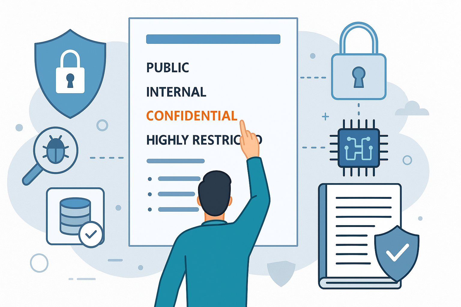
How Security Classification Guides Strengthen Data Protection in Modern Cybersecurity
A Security Classification Guide (SCG) defines data protection standards, ensuring sensitive information is handled securely across all levels. By outlining confidentiality, access controls, and declassification procedures, SCGs strengthen cybersecuri

Artificial Intelligence – A Growing Field of Study for Modern Learners
Artificial Intelligence is becoming a top study choice due to high job demand and future scope. This blog explains key subjects, career opportunities, and a simple AI study roadmap to help beginners start learning and build a strong career in the AI
Java in 2026: Why This ‘Old’ Language Is Still Your Golden Ticket to a Tech Career (And Where to Learn It!
Think Java is old news? Think again! 90% of Fortune 500 companies (yes, including Google, Amazon, and Netflix) run on Java (Oracle, 2025). From Android apps to banking systems, Java is the backbone of tech—and Sulekha IT Services is your fast track t