Which alternative will you prefer?
Having your data presented in rows and columns of easy-to-miss and straining to see spreadsheets;
OR
Data presented in graphical format using graphs, charts and infographs?
Obviously the latter right? Why? Because it makes decision making easier and a lot more interactive. Arriving at a decision becomes effortless when the desired information can be seen prominently without too much of probing.
The benefit of visualizing data for analysis is that, trends become more visible and easily understandable for users. Unlike in conventional forms of data presentation, data visualization helps users grasp information quickly and effectively without taking much time for comprehension. It cuts down the unnecessary data that causes clutter without giving any value addition.
“Decision making isn’t always easy, and sometimes we make errors on seemingly trivial tasks, especially if multiple sources of information compete for our attention,” says Tobias Teichert, PhD, assistant professor of psychiatry at the University of Pittsburgh.
Better visibility of trends and business statistics lead to better decision making which in turn helps gaining an edge over competition. In fact, data visualization is largely used to foresee changes in the market and scenarios that are ahead of the curve where a business can potentially strike gold if it starts planning now.
Now that Big Data has become prominent in large business houses, data visualization is nothing but the next big thing in data analytics that is emerging with a powerful presence. Data visualization will prove to be an essential component in all major Big Data certification courses where the aspirant will learn to visualize data graphically after conducting successful analysis on it.
Blast from the past: Data Visualization was used in military strategizing
The first use of data visualization for decision making happened even before the advent of computer systems. Charles Minnard was the first individual who drafted the map depicting Russian topography where Napoleon unleashed his brutal attack. Charles tied the temperatures of the areas where Napoleon’s army retreated and coordinated them with the timescales to arrive at a more in-depth understanding of the actual events that led to Napoleon’s defeat.
Needless to say this form of pictorial presentation of information for critical thinking and data analysis did reveal from ground breaking results.
However, in the modern scenario where blazing fast computers process thousands of gigabytes of information per millisecond, data visualization plays an almost equal crucial role as it played in reframing history. The need for data visualization is felt more gravely now in industries like banking, retail, healthcare, telecommunications, etc.
Back to the future: Data visualization and its growing significance
The question that arises when one things of Data Visualization is – how and to what extent can it be used for finding value in Big Data Analytics? It is indeed just from the part of corporations to know more about a technology and the legitimacy of its promises before committing millions (if not billions) to its implementation.
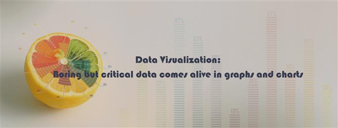
Common types of data visualization
The images below show how graphical charts and graphs can be used to represent data in a better light that facilitates decision making.
Data visualization helps businesses digest large volumes of data with better clarity and coherence. As can be seen from the images above, there are plenty of ways in which data can be graphically depicted that go beyond the usual forms of data analysis. The varied forms of data presentation ensure that a business is able to think from various angles regarding a situation and arrive at purposeful decisions of value.
Needless to say, it will bring about a sea change in financial statement analysis and understanding consumer behaviour patterns as better insights based on country, age, demographics, etc. can be drawn quickly and effectively. Swift information comprehension will enable businesses to make on spot decisions to leverage the market condition. Correlating business relationships and patterns is also a related benefit of data visualization.
Spreadsheets are going to stay since they are instrumental for computation of figures, but the way data analysis will be done in the future will take a paradigm shift to pattern, graphs and charts based visual data.
Take the next step towards your professional goals in
Don't hesitate to talk with our course advisor right now
Receive a call
Contact NowMake a call
+1-732-338-7323Related blogs on General to learn more

From Student to AI Pro: What Does Prompt Engineering Entail and How Do You Start?
Explore the growing field of prompt engineering, a vital skill for AI enthusiasts. Learn how to craft optimized prompts for tools like ChatGPT and Gemini, and discover the career opportunities and skills needed to succeed in this fast-evolving indust

Cyber Security in 2025: The Golden Ticket to a Future-Proof Career
Cyber security jobs are growing 35% faster than any other tech field (U.S. Bureau of Labor Statistics, 2024)—and the average salary is $100,000+ per year! In a world where data breaches cost businesses $4.45 million on average (IBM, 2024), cyber secu
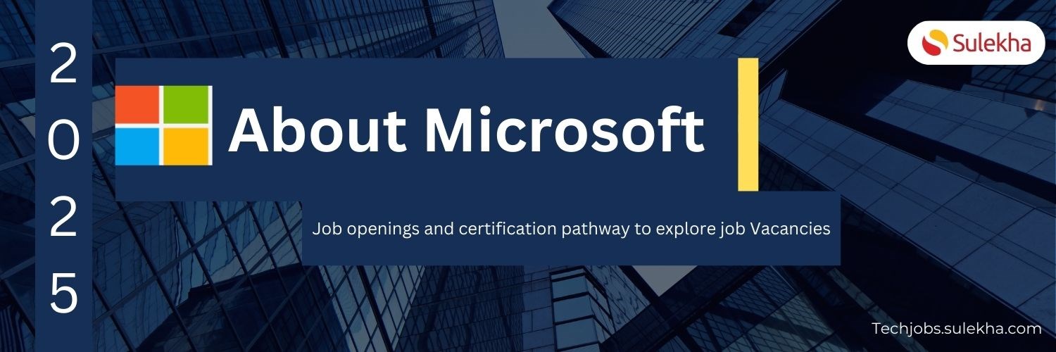
About Microsoft Job Openings and Certification Pathway to Explore Job Vacancies
Explore exciting Microsoft job openings across the USA in fields like software engineering, data science, cybersecurity, and more. Enhance your career with specialized certifications and land top roles at Microsoft with Sulekha's expert courses.

What is Application Lifecycle Management (ALM)? A Comprehensive Overview
Application Lifecycle Management (ALM) is a comprehensive approach that oversees the entire lifecycle of an application, from initial planning and development to deployment and maintenance. By integrating processes, tools, and methodologies, ALM ensu

Introductory concepts of product development
Bringing innovative ideas starts with mastering product development concepts that bridge creativity and practicality.

Exploring the Learning Opportunities in USA
What are the different programs available for students?The United States offers a wide range of learning opportunities for International Students. There are Undergraduate and Graduate Programs. The U.S. has over 3000 accredited institutions offering

About Zscaler
Discover how Zscaler’s cloud-native, zero-trust security platform empowers businesses with scalable, efficient cybersecurity solutions and opens career paths in cloud security.

About High Point University
"Explore High Point University, North Carolina's premier liberal arts university, offering rigorous academics, innovative programs, and hands-on experiences for student success."

Top 8 high paying freelance jobs you can start today
"Explore the rise of remote work in IT and non-IT sectors, its impact on work-life balance, and high-paying freelance opportunities such as web development, graphic design, and virtual assistance."

How Sulekha IT Services Can Help You Upskill and Reskill
"Discover how Sulekha IT Services connects you with top IT courses to upskill and reskill, offering flexibility, quality training, and career-boosting opportunities in the USA and Canada."
Latest blogs on technology to explore

Drug Safety & Pharmacovigilance: Your 2026 Career Passport to a Booming Healthcare Industry!
Why This Course Is the Hottest Ticket for Science Grads & Healthcare Pros (No Lab Coat Required!)" The Exploding Demand for Drug Safety Experts "Did you know? The global pharmacovigilance market is set to hit $12.5B by 2026 (Grand View Research, 202

Launch Your Tech Career: Why Mastering AWS Foundation is Your Golden Ticket in 2026
There’s one skill that can open all those doors — Amazon Web Services (AWS) Foundation
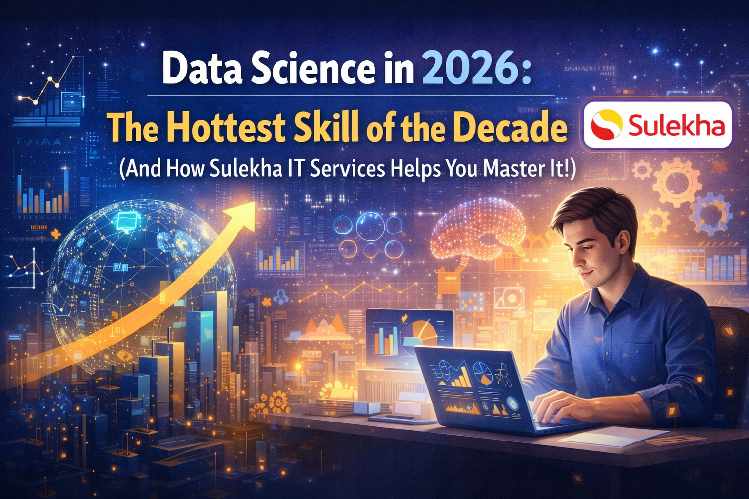
Data Science in 2026: The Hottest Skill of the Decade (And How Sulekha IT Services Helps You Master It!)
Data Science: The Career that’s everywhere—and Nowhere Near Slowing Down "From Netflix recommendations to self-driving cars, data science is the secret sauce behind the tech you use every day. And here’s the kicker: The U.S. alone will have 11.5 mill

Salesforce Admin in 2026: The Career Goldmine You Didn’t Know You Needed (And How to Break In!)
The Salesforce Boom: Why Admins Are in Crazy Demand "Did you know? Salesforce is the 1 CRM platform worldwide, used by 150,000+ companies—including giants like Amazon, Coca-Cola, and Spotify (Salesforce, 2025). And here’s the kicker: Every single one

Python Power: Why 2026 Belongs to Coders Who Think in Python
If the past decade was about learning to code, the next one is about coding smarter. And in 2026, the smartest move for any IT enthusiast is learning Python — the language that powers AI models, automates the web, and drives data decisions across ind

The Tableau Revolution of 2025
"In a world drowning in data, companies aren’t just looking for analysts—they’re hunting for storytellers who can turn numbers into decisions. Enter Tableau, the #1 data visualization tool used by 86% of Fortune 500 companies (Tableau, 2024). Whether
From Student to AI Pro: What Does Prompt Engineering Entail and How Do You Start?
Explore the growing field of prompt engineering, a vital skill for AI enthusiasts. Learn how to craft optimized prompts for tools like ChatGPT and Gemini, and discover the career opportunities and skills needed to succeed in this fast-evolving indust
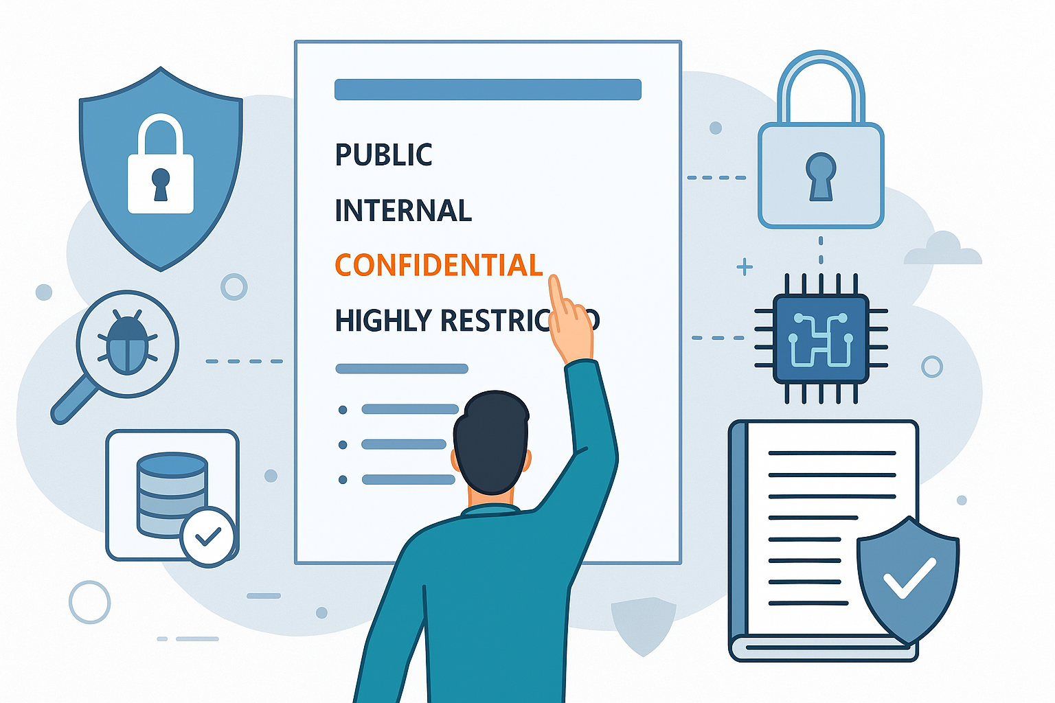
How Security Classification Guides Strengthen Data Protection in Modern Cybersecurity
A Security Classification Guide (SCG) defines data protection standards, ensuring sensitive information is handled securely across all levels. By outlining confidentiality, access controls, and declassification procedures, SCGs strengthen cybersecuri

Artificial Intelligence – A Growing Field of Study for Modern Learners
Artificial Intelligence is becoming a top study choice due to high job demand and future scope. This blog explains key subjects, career opportunities, and a simple AI study roadmap to help beginners start learning and build a strong career in the AI
Java in 2026: Why This ‘Old’ Language Is Still Your Golden Ticket to a Tech Career (And Where to Learn It!
Think Java is old news? Think again! 90% of Fortune 500 companies (yes, including Google, Amazon, and Netflix) run on Java (Oracle, 2025). From Android apps to banking systems, Java is the backbone of tech—and Sulekha IT Services is your fast track t